Book Review: "Color, Environment, and Human Response" by Frank H. Mahnke
- Olivia Donnis
- Aug 29, 2025
- 2 min read
Some books feel like conversations with someone who truly loves what they do, and Frank H. Mahnke’s Color, Environment and Human Response is one of those books. From the first chapter, his curiosity about how color shapes our emotions, behaviors, and even health piqued my own curiosity. As a student majoring in interior design and small business development, with a minor in psychology, I recognize many parallels between Mahnke’s enthusiasm and my own growing interest with the ways design can influence how we feel and interact with the world around us.
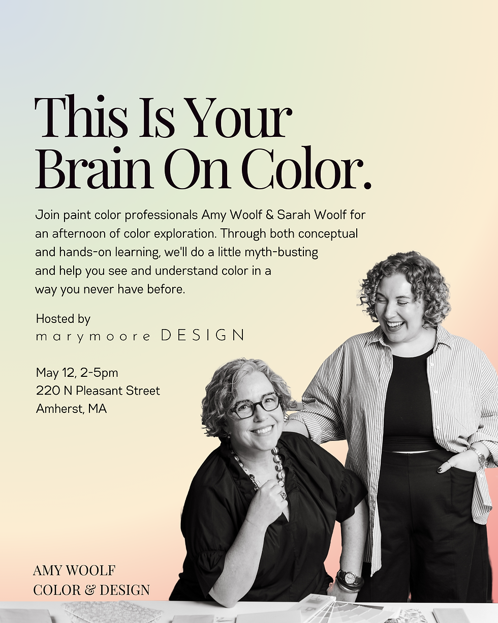
Color is more than a decorative aspect. It’s truly an experience. During my studies at Bay Path University, I’ve explored how psychological principles influence the way people respond to space. My understanding of this concept has grown during my internship with Amy Woolf Color & Design, where Amy and Sarah exemplify firsthand how intentional color choices can foster comfort, function, and emotional balance. Mahnke’s words offer both scientific and artistic interpretations that align well with these experiences.

Mahnke turns something as seemingly ordinary as color into a subject that is rich in meaning and purpose. He explains clearly that our response to color is rooted in evolution, as our brains have been wired to perceive color for survival, but culture, personal experiences, and memories add layers of complexity and meaning to each individual. His explanation of the “color experience pyramid” stuck with me; it’s a broken down way to understand how our innate reactions to color evolve into more personal and cultural associations. This is why color isn’t just about what we see, but what we feel and remember when we see it.
The book balances research with real-world application, offering insights for spaces like hospitals, restaurants, and schools -- places where color choices can deeply affect well-being, productivity, and mood. These insights can be applied in a variety of ways; however, it becomes clear that there is no universal shade of white or gray that will fit perfectly into every space, for every client. Color design is very contextual and must consider the “whole picture” of a space.
As someone just starting my career, Mahnke’s blend of science and storytelling reminded me of why I fell in love with design in the first place. His examples and my hands-on experience working with Amy and Sarah have shown me how to use color with more intention, and as a tool to create healthier, more uplifting environments. Though the book was published in 1996, the message remains fresh. Trends may come and go, but the way humans respond to color remains constant.
Mahnke, F. H. (1996). Color, Environment, & Human Response. John Wiley & Sons, Inc.


Comments